Winn-Dixie Corporate Brand Identity System Winn-Dixie
Design Problem
Winn-Dixie is one of the longest standing grocery stores in the region; however in recent years it has been steadily declining, and has become irrelevant. To regain market share they are developing a new store format and needed their branding to reflect this new image.
Solution
The new brandmark puts an emphasis on the core attributes of Winn-Dixie’s new image which are everyday luxury, fresh, inviting, reliable, and value. The heart and crown symbol can be interpreted many different ways such as a strawberry, tomato, as well as other fruits and vegetables; the leaves form both a three-pointed crown and a ‘W’ for Winn-Dixie.
The New Winn Dixie
The primary brandmark configuration has no tagline, which makes a powerful statement as it lets the brandmark stand on its own, and puts an emphasis on visual clarity. This leads for a general purpose mark that works well across all applications and the preferred choice for signage.
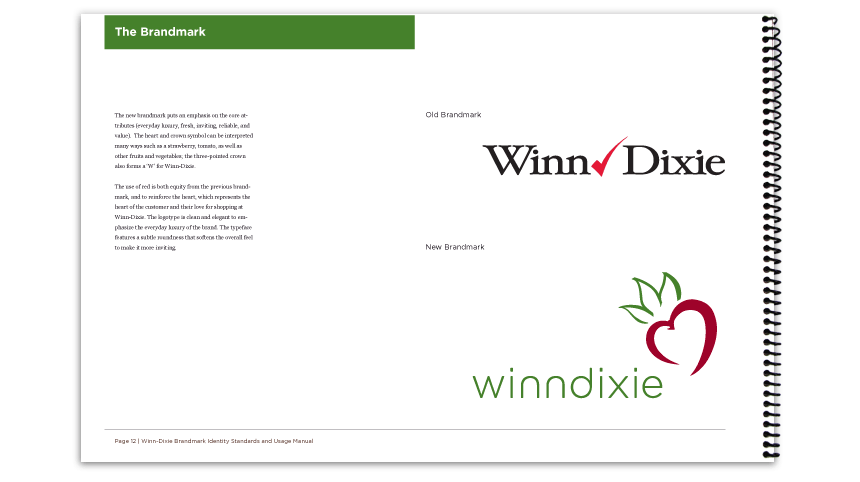
Old vs New
The old brandmark as it compares to the new brandmark. Beside them is the rationale behind the new brandmark.
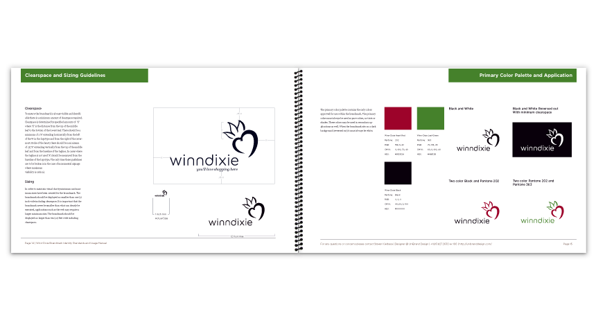
Usage Guidelines
This spread outlines the clearspace requirements and permitable color variations for the new brandmark.
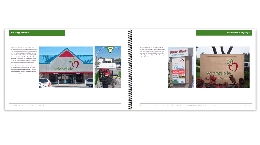
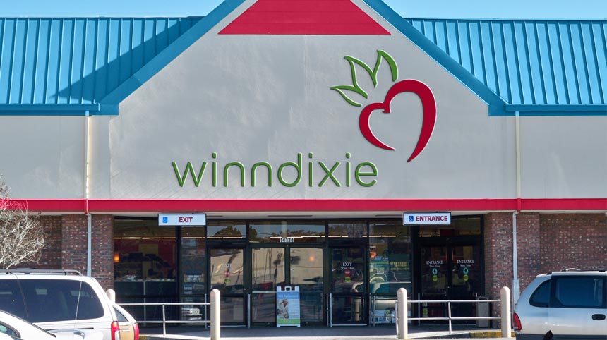
Exterior Signage
An overview of the exterior signage. Examples include the storefront, car corral and monumental signage.
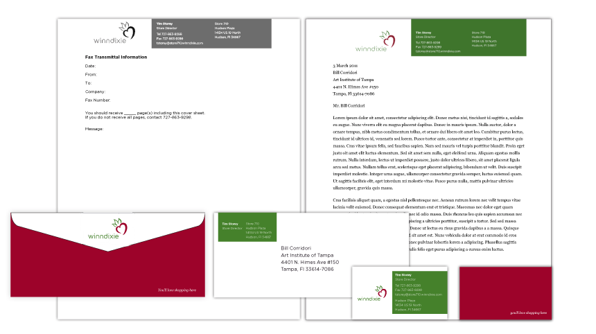
Stationery System
The application of the identity system across the entire stationery system.
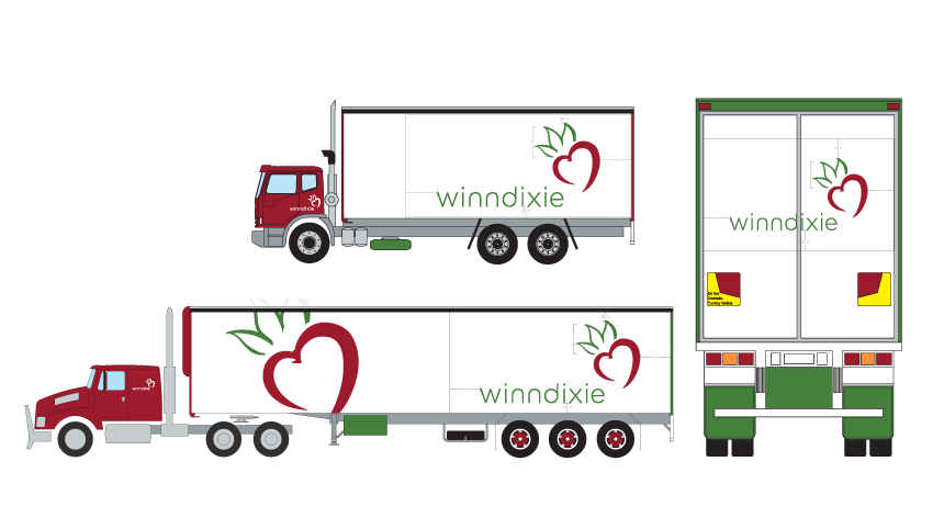
Delivery Trucks
The brandmark as it would appear on various delivery trucks.