Another year, another design. Well, there’s more to it than that, though that seems to be the trend around here. This is a pretty big deal for me, mostly because of what went into this design and the re-inclusion of a blog. I’ve been wanting to do some writing about various topics for a while now and I’m finally going to start.
The web Zeitgeist
It’s a fact, the web is constantly evolving. Websites can begin to feel dated pretty quickly these days. Great design may be timeless, but if the technology it’s built on become obsolete or falls out of fashion it can still feel stale, or worse, function poorly.
This is the philosophy I use when thinking about my digital portfolio. Beyond that, as web design is one of my primary disciplines, my portfolio isn’t just a vessel to present pieces with, it is a piece unto itself. One of the first things fellow developers do is open dev tools and inspect source.
Let’s start at the beginning
The first thing I did was take inventory of my previous site (v11). I analyzed and critiqued the content and the design, seeing what worked and what didn’t and, most importantly, why those worked or didn’t work. I got all of this into writing, creating a design brief of sorts to work from. Taking this into account, I wrote down a series of goals and desires.
The previous version was a great stop-gap to correct the issues of the portfolio I left school with (v10) by being responsive, less overly designed, and less dated feeling. That said, it left a lot to be desired.
While v11 may have been responsive, it doesn’t do it well, as it was the first responsive site I had ever built. Every page type has numerous unique breakpoints, and no fluidity; essentially a collection of fixed width views that snap in at different browser widths. There were some minor broken layout issues (particularly the footer).
Most importantly, the site didn’t do the work justice. The previous design did a great job getting out of the way to try to let the work shine, however the actual presentation of the work was kind of lack luster. Further, while my personality was present in v11, the site felt emotionless; stark and reserved in a way not congruent with my personality.
Goal setting
Like I said, I took the above notes and used them to create a set of design goals. Some of these goals were actually in opposition of each other, which meant I had to do a careful balancing act (but when don’t you in design). I should note that these aren’t all goals but rather things to be mindful of.
Content is king
This one is pretty obvious, but it was the crux of this redesign. I wanted to present the content in a more engaging and visually impactful way. I wanted to be able to update and curate the content more easily hoping that would allow me to possibly highlight the best of the best, giving them more presence. There was also some outdated content that I hadn’t updated due to the hassle involved. This further drove the need for easy updating, I don’t want stale content. Ideally, all of this work on improving content would then decrease my site’s bounce rate (I have a lot of room for improvement).
Let my personality show
I wanted to bring more of myself into all facets of the site. Version 10, others and myself, felt represented my personality quite well. Unfortunately, most of that got lost when designing v11. I wanted to incorporate more elements that would let people see my personality. Bluntly, I wanted someone who knows me to be able to look at the site and with a gut reaction say, “That’s you alright,” in a positive manor.
Nerdy stuff
A chief goal was better and simpler responsiveness. I was thinking of probably going mobile first, since that’s what the cool kids do and all, since, well, it’s important. A unique goal I regularly set for web design projects is what I refer to as an imageless design. All non-content elements should be made in some manner that doesn’t require an image. For the record, I don’t consider inline SVG as an image since it’s all in code. Playing off of wanting to improve content, and due to having a new Retina Macbook Pro, I wanted to make the site retina ready.
For me, and most people I’m sure, a speedy site was very important. I set a maximum page weight of under 900KB total per page. This stood in stark contrast with many design decisions. Taking this further, I set the lofty goal of having the site load in under 500ms. I set this goal knowing I wouldn’t be able to do it, but the lower the target, the easier attempt to maintain quick loads.
Based on other goals, getting on a CMS was more of a requirement than a goal, but I’m putting that in here. Also, I try to make everything I do a learning experience; I understand the importance of working with version control, but was honestly a little scared of it. Due to that I made it a point that I wanted the entire project from design to deployment to be under version control.
The outcome
I’d like to believe I nailed the vast majority of the goals. Some just weren’t practical or were deliberately above and beyond what was achievable.
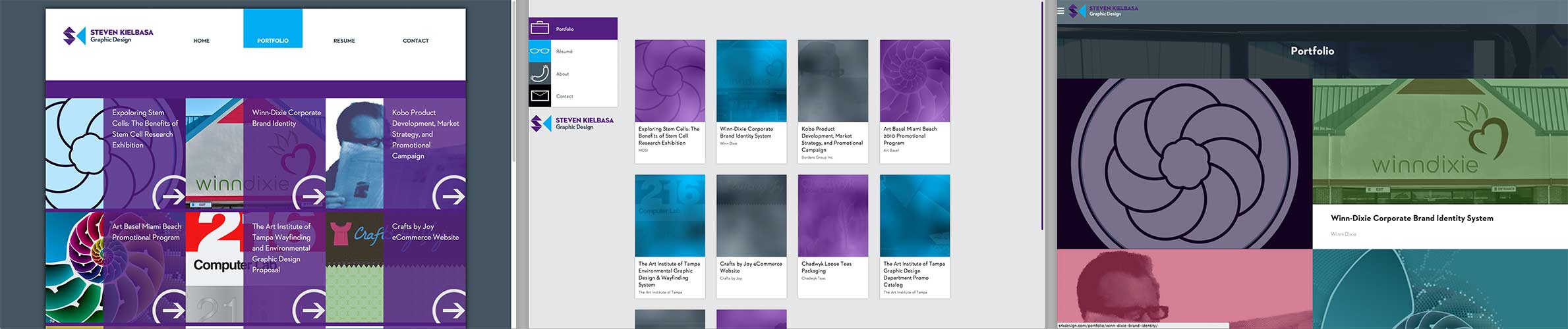
The new design presents the content in a much more visually exciting way. Portfolio images are now larger taking up a sizable portion of the viewport, this helps guests see finer details better. Projects now have “branded colors” this means that each project features on page elements that match the client’s branding. This helps make the project feel more holistic as well as providing additional visual interest; additionally, this gives projects visual separation from one another. The content is finally in a vessel that does it the justice it deserves. I decided against highlighting select projects beyond linking to a few from the homepage as I always have. I do have some ideas for revisiting this down the road. Only time will tell how this affects traffic and bounce rates.
Overall, I think this design captured my personality quite well, I look at it and see a reflection of me. I hope others feel the same. I wish I had a tangible way to explain why I feel this way, but this is just a case of gut reaction and instinct. Obviously, I did get a blog up and running as you’re reading this on said blog.
The site is proudly powered by WordPress. In an effort to improve page speeds, I left my fairly terrible economy shared hosting plan in favor of a VPS at Digital Ocean. I’m using their budget plan, but it’s still significantly faster and more robust than my previous host. This offered a the much needed speed boost required to even try to hit my speed goals.
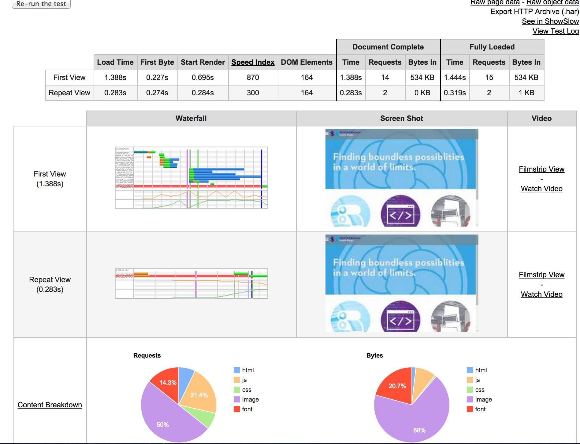
I may not have nailed 1000ms to glass, but it is a pretty snappy site with return trips taking less than a half second. I broke the CSS into multiple files with a global style sheet that has all of the shared styles and the homepage styles in it, and a style sheet for each unique section of the site. This means smaller files that get downloaded only as needed. The same was done for the JavaScript files. Picturefill 2.0 is handling the responsive images quite swimmingly.
I used Git for version control throughout the whole process. That was quite the experience. Even using a GUI for it, it just felt weird and hard at first. By the time this design went live, I felt quite comfortable with it and even started using the GIT flow methodology.
Let’s talk design
Personally, I’m quite pleased with the design. Is it perfect? Far from it, I’m going to be making little tweaks here and there for quite a while I’m sure. Visually its a radical departure from the previous version (and that was a radical departure from the version before it). Aesthetically, the current design is kind of a combination of the two previous versions. That’s a good thing, it means the design is more of an evolution than a revolution. Fundamentally, the overall layout of the site has been consistent across the these three most recent versions—the homepage features three works and presents my ethos statement, projects are presented in a block grid, project details open with problem and solution statements followed by captioned images and a full page contact form.
Responsive done right
Er, uh… done very well. The whole site only has 4 breakpoints. The actual design, at a concept level, was created mobile first; however, it was coded desktop first. The reason being that this site’s primary focus is being a portfolio and the majority of people looking through a portfolio would be doing so at work on a computer; plus according to my analytics I get very few mobile hits. The site starts at a medium-ish desktop size and using desktop first media queries shrinks down, and using mobile first media queries expands to extra large desktops. Odd, but surprisingly effective way of managing breakpoints, at least for me. The whole site is 100% width, with just a few elements having max-widths on them.
SVG EVERYWHERE!
Literally, every graphic that could be made with an SVG was. All of the nav icons, the social icons, the branding and the hamburger, company logos, content icons and my signature are all inline SVG. This makes them look super crisp on retina displays and most of them are smaller than their raster equivalent.
It’s so huge
That’s what she said jokes aside, that really was a focus with this design by using big and beautiful images all over. This helps with visual interest as well as making it much easier for guests to see the finer details within the artwork. Thanks to the way responsiveness was handled, it is possible to get things like portfolio images very large, to the point where they practically fill your screen, and text becomes readable from a distance.
A refined pallet
This design makes better use of my brand’s secondary color pallet than any previous design, plus there are three new colors. YAY FOR LESS GREY! Version 10 pretty much only used my two primary colors, and the previous design was grey on grey on grey; that’s not the case here, and I like it that way. It keeps the site from looking bland and muddy.
It’s all about the portfolio
Work is presented big, bold, and vibrant. The details about the project such as client, and the problem and solution statements still sit atop the page providing guests with a back story for the project. Gone is the slideshow, now all of the elements of a project spread out down the page. Usability experts agree, slideshows suck. You, know what users do know how to do, and do well? Scroll. This means guests should have a higher satisfaction rate and actually spend more time on page because they’re actually viewing more content.
Off canvas navigation, all the time
Off canvas navigation has hit the point where the vast majority of users know what it is and how to use it. Usually, it’s only used for mobile navigation. I chose to use it for all views because it gets the navigation out of the way, while still being accessible. This means, you guessed it, more room for content.
Hello blog
The new blog presents posts in a color code based on category. There are five main categories. When reading a post there is a left hand sidebar that displays you current category and can be expanded to show more posts from the category and a list of all categories. Bellow that is a list of related posts. The type size of the body text of the post responds to your browser width, getting larger as you make the window wider.
Flexbox
I cannot not talk about this. The layout for this design was built using flexbox. Right off the bat that means IE10+ for support, but according to my analytics, that really isn’t an issue for this site. You might be asking why. One, I wanted to learn flexbox. Two, it makes equal heighting things with dynamic heights drop dead simple. It also, allows me to easily change the order of on page elements without changing their source order (inspect element on a portfolio project to see what I mean). There are some caveats, but I can’t wait till this can be used on larger production sites.
Wrap up
I think this design achieves what I set out to do. I’m hoping that it has some added longevity, v11 was around the longest at just 18 months. If this design, or a minor evolution of it could last 24+ months I would be ecstatic. I learned quite a bit during the building of this new design, which is always a good thing. I will be tweaking this over the course of the next few months I’m sure, but the design is solid. I have a lot of ideas already brewing for blog post, too. Feel free to leave your thoughts in the comments bellow.