Yesterday, like so many, I eagerly updated my Mac as Apple pushed the latest version of its OS (a statement you would have never heard me say a year ago, but that’s for another time). I hadn’t played with the beta, so while I knew all the changes, thanks to my friend at www.nettoyersonmac.fr hooking me up – this was the first time I got to play with it.
The design
The first, and most obvious change is the design. I’ve never been a huge fan of Apple’s OS styling. It became passible in Leopard and and pretty decent in Mavericks. Yosemite actually makes it nice. I’m not fan of iOS7+’s design, it’s too flat, and I love flat; but Yosemite is more than making OSX look like iOS like some would have you believe. Instead, it strikes a nice balance between the old look and iOS’s. It’s flat, there are transparencies, but it’s tastefully done. I can’t help but be reminded of Windows’ Aero styling.
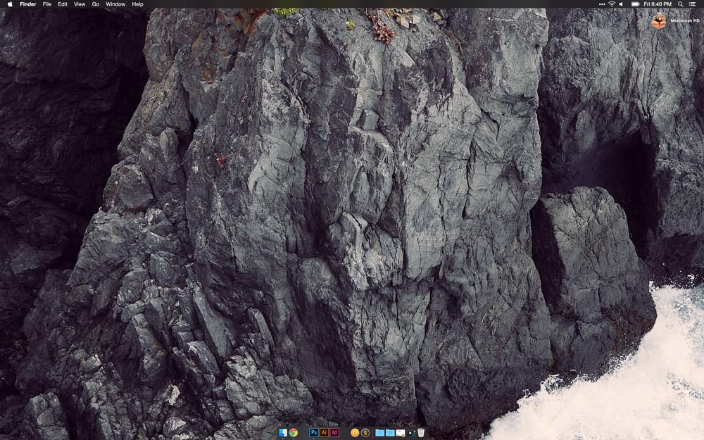
My favorite part is got to be the dark menubar. On my Macbook Pro it looks as though the menubar is part of the screen bezel, like Android’s on-screen nav buttons. It’s even better when coupled with the graphite color theme as menu highlights pick up on your wallpapers colors. The folders icons are a little garish, but they’re growing on me.
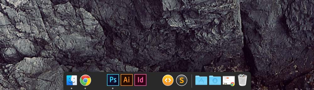
The dock, however, feels like a step backwards. I’m not sure why, but I just really hate it. Again, using the dark menubar theme helps, so does the wallpaper I happen to be using. Also annoying, is that not all of my apps have been updated to support the dark menubar. For instance, Chrome (specifically the Hangouts extension) and Evernote. There’s also so transparent elements that don’t make much sense sprinkled about the UI.
Usability
Not much has really changed on this point, and that’s a good thing. I was afraid it would end up like iOS where there’s no contrast between any UI element making it hard to navigate the various bits of OS chrome. Thankfully this isn’t the case. There’s enough separation between UI elements that it remains easy to navigate.
What has seen a huge improvement is notification center and widgets; which went from useless to very handy. Integrating widgets into the notification center brings added utility, by not interrupting what you’re currently doing (unlike dashboard). Checking notification center is now like looking at an overview of my day paired with handy tools. Before, the sole reason I would open notification center was just to clear out notifications.
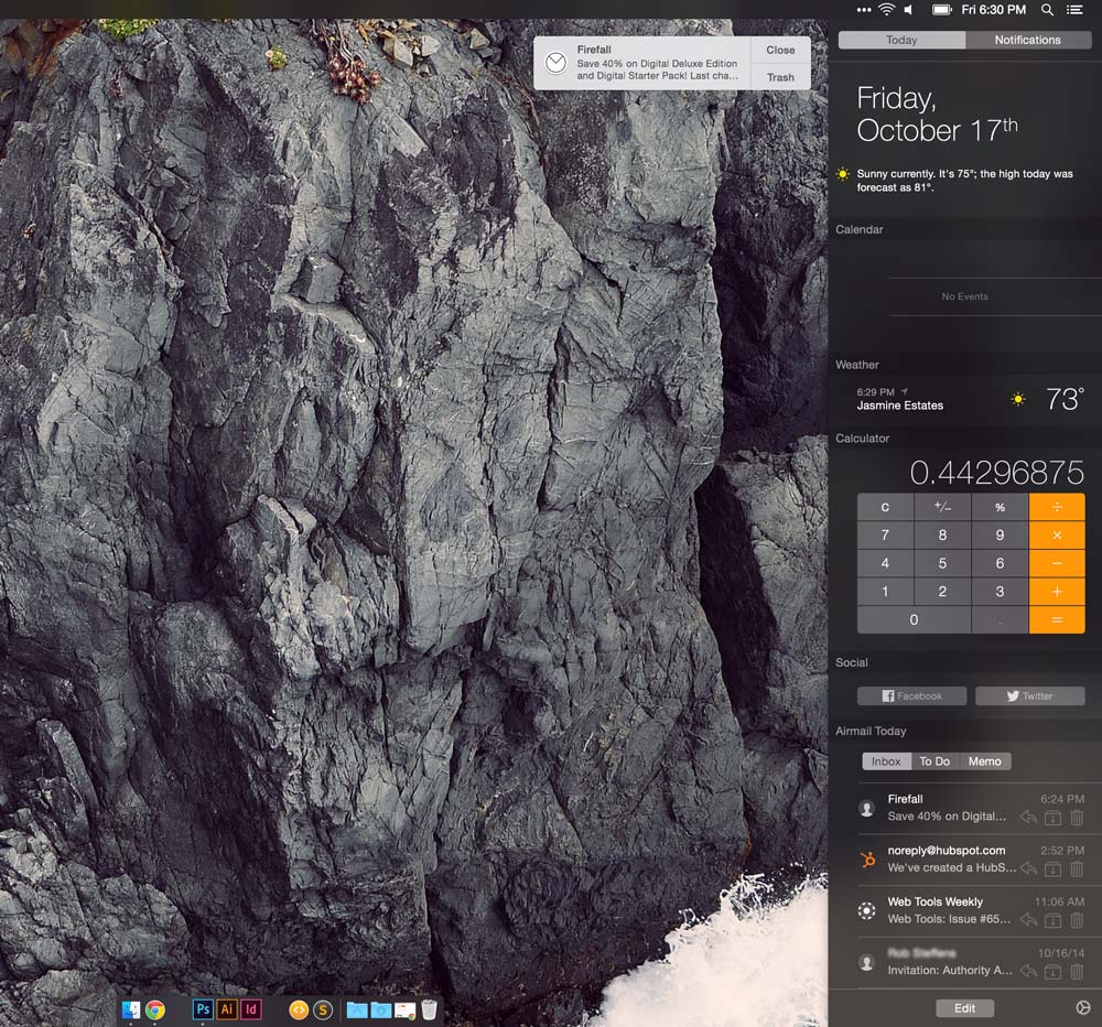
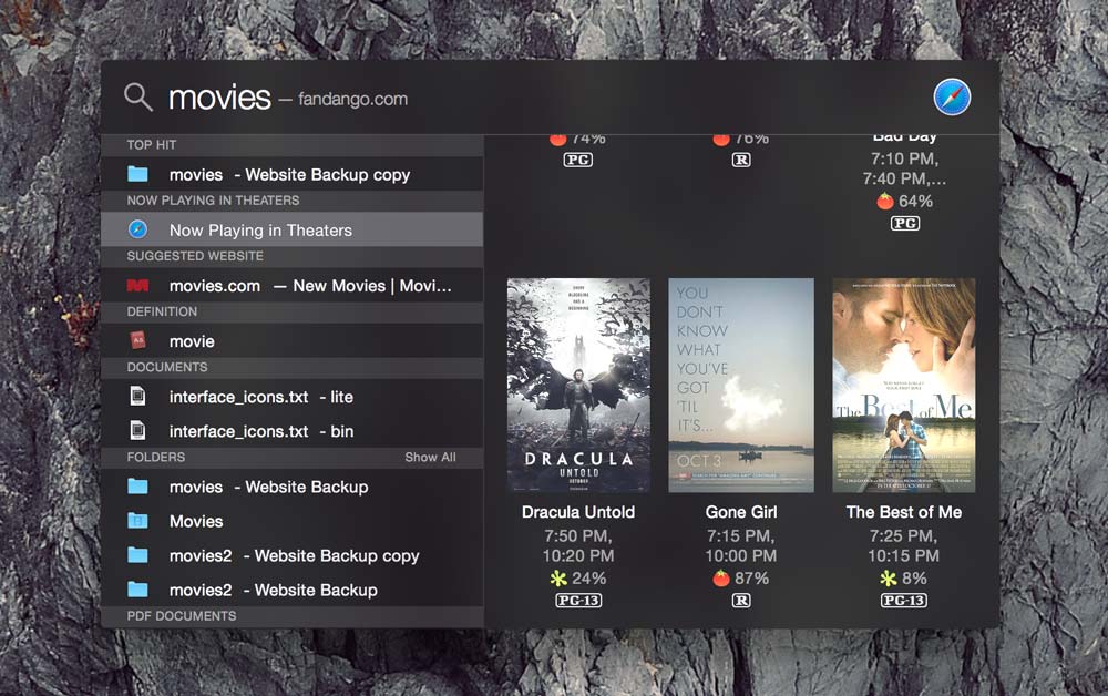
The revamped spotlight is also quite handy. I’ve been holding off on spotlight replacements like Alfred, knowing that this overhaul was coming. I’m not disappointed. It offers, what is essentially, Google knowledge graph inside of spotlight, allowing you to pull rich web content like movie times, Wiki articles, etc. as well as previews of media on your machine.
Software compatibility
I did run into some compatibility issues with a few programs. MAMP, for instance, would fail to start Apache; there was an updating ready to go to fix this however. Likewise, Airmail had some issues with not staying running if set to only run from the menubar. There is a paid upgrade to version 2.0 that fixes this. Dropbox also failed to run post upgrade. It, too, had an update that fixed its issues. The only other issues I ran into were the menubar icons I’ve already mentioned.
Performance
I’m probably not the best person to talk about this as I’m running a late 2013 Macbook Pro Retina with every upgrade, but Yosemite, seems to run exactly the same as Mavericks did, although it might be making my computer ever so slightly warmer. Also, after updating my internet was very slow. I had to forget the connection and then reconnect and it’s been fine since.
Overall impression
As a technophile, I’m an update junkie. Despite the clouded head of a new update, I can say with certainty to any fence sitters, “Go and take the damn update already.” It’s not ‘amazing’ or ‘magical’ as Apple would have you believe; but it does bring a lot to the table over Mavericks.